Finding a ticket website for a GamificationSummit event looks simple until you reach checkout. A low ticket price can hide fees, a good-looking page can have a confusing registration form, and a payment can succeed without giving clear instructions about what happens next. I looked at the buying process from the attendee side because the website should make the purchase easy to understand. The right choice depends on the complete journey, not just the ticket page.
Why the Ticket Website Matters
When someone searches for websites for ticket sale gamificationsummit, they usually want a simple answer: where can I buy the ticket? But the website does more than collect payment. It introduces the event, shows available ticket types, explains prices, collects attendee information, processes payment, and delivers confirmation.
That makes the ticket website part of the attendee experience. If the buyer has to search several pages to understand the ticket price or payment process, trust can drop before the purchase even happens. The same problem can appear after payment if the buyer does not receive a clear confirmation or ticket.
I also think event organizers should separate the event website from the ticketing system. An event can have a strong main website while using a different service for registration and payment. The important question is whether those systems work together smoothly from the buyer’s point of view.
The First Thing I Check: The Ticket Page
The ticket page should answer basic questions before asking the buyer to pay. I want to know what the ticket includes, when it expires, whether the price can change, and whether additional fees apply.
A good ticket page does not force the buyer to guess. If an Early Bird ticket has a lower price, the page should clearly explain the deadline or quantity. If a Normal ticket becomes available later, the buyer should understand why the price changed. These details matter because ticket pricing can affect whether someone completes the purchase.
The same principle applies to ticket quantities. If only a limited number of tickets remain, the website should communicate that accurately. Organizers should not create artificial urgency just to push sales. Clear information gives buyers a better reason to complete the purchase.
Price Transparency Matters
The headline ticket price is only one part of the buying decision. A buyer may see a $50 ticket and then reach checkout with service fees, processing fees, taxes, or other charges.
That does not automatically make the ticketing system bad. The important point is that the buyer should understand the final amount before submitting payment. Event organizers should test the complete checkout process instead of checking only the public ticket page.
For example, Eventbrite explains that organizers can choose how certain fees appear and whether the organizer or attendee covers applicable fees. Its official registration tools also support different ticket types, discounts, add-ons, and checkout options.
This is why I would compare the final checkout amount, not just the advertised ticket price.
Early Bird and Normal Tickets
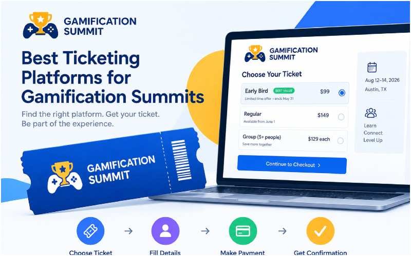
Gamification events often use different ticket stages. An Early Bird ticket can encourage people to register sooner, while a Normal ticket can remain available after the early period ends. The important part is making the change easy to understand. The buyer should see the ticket name, price, availability, and any relevant deadline without hunting through the website.
A simple structure works well:
| Ticket type | What the buyer should see |
|---|---|
| Early Bird | Price, deadline or quantity limit |
| Normal | Current price and availability |
| Group | Number of people required and total price |
| Add-on | Extra cost and what it includes |
A platform should support these choices without making the checkout confusing. Whova, for example, documents support for multiple ticket types, dynamic pricing, Early Bird tickets, discount codes, add-ons, and group tickets.
The Registration Form Can Create Friction
After choosing a ticket, the buyer normally reaches the registration form. This is another place where a simple purchase can become frustrating.
Event organizers should only ask for information they actually need. Name and email may be enough for a basic event, while a professional conference may need a company, job title, dietary information, or other attendee details.
Too many unnecessary questions can make the process feel longer. At the same time, collecting too little information can create problems later when the organizer needs to manage attendees. The form should therefore match the event’s real operational needs.
I would also check whether the form clearly marks required fields. A buyer should not reach the end of checkout only to discover that several fields remain incomplete.
Mobile Checkout Deserves a Real Test
Many people will discover an event on a phone. That makes mobile checkout part of the ticket-buying experience rather than an optional extra.
I would test the complete process on a phone instead of simply opening the ticket page. The test should include selecting a ticket, entering attendee information, reviewing the total, choosing a payment method, completing payment, and finding the confirmation.
Buttons should remain easy to tap, text should remain readable, and the buyer should not need to zoom in and out to complete basic actions. If a form behaves differently on mobile, the organizer should fix that before sending traffic to the ticket page. Eventbrite’s official tools include mobile-oriented checkout and ticketing features, while its ticket widget can also place ticket sales directly on an organizer’s own website.
Payment Is the Real Test
A ticket website may look professional until the buyer reaches payment. That is where the system has to connect the ticket selection, attendee information, order, payment method, and confirmation.
Payment options should match the audience. Depending on the event and location, buyers may expect cards, digital wallets, bank payments, or other local methods. The organizer should also make sure the payment page clearly identifies the event or business so the transaction does not look suspicious.
Cvent’s official registration documentation shows how larger event registration systems can connect registration with payment services and reporting. It also supports multiple currencies and payment methods.
The key lesson is simple: do not judge a ticket platform only by its event-page design. Test the payment journey.
What Happens After Payment?
A successful payment should not be the end of the buyer journey. The buyer needs confirmation that the order succeeded and clear information about what comes next. The confirmation should normally tell the attendee that the registration completed, identify the event, provide the ticket or registration details, and explain how to access the event later.
This becomes especially important for digital or QR-based tickets. If the buyer receives only a payment receipt but no usable ticket information, they may have to contact the organizer even though the payment worked. Eventbrite’s official buyer guidance describes a flow where the attendee selects tickets, completes checkout, receives an order confirmation, and accesses the ticket.
That complete flow is what I would test before considering a ticket website ready for real buyers.
Do Not Confuse Ticketing With Event Gamification
A GamificationSummit can use points, badges, challenges, leaderboards, networking activities, or other interactive elements. However, the ticketing system does not need to perform all of those functions. The ticket website has a more basic job: help the attendee understand the event, select the correct ticket, pay securely, and receive the information needed for attendance.
The gamification layer can come later. Trying to place too many event features inside the purchase process can make checkout harder to understand. A better approach is to keep the purchase journey focused. Once the attendee completes registration, the organizer can introduce the event app, challenges, networking activities, or other engagement features.
The Platform Does Not Create Demand
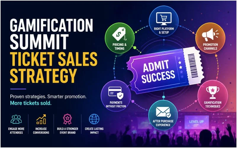
One mistake organizers can make is expecting the ticketing platform itself to generate enough buyers. A platform can provide registration pages, payment tools, ticket types, reporting, and promotional features, but it cannot replace event marketing. This is one reason I would separate ticket selling infrastructure from ticket sales strategy. The infrastructure handles the transaction. Promotion brings people to the transaction.
I covered this distinction in more detail in my guide on what actually works for GamificationSummit ticket sales. The same idea applies to checkout optimization. A perfect checkout cannot fix a weak event offer, unclear audience, or poor promotion.
What Different Platforms Show
There is no single ticketing setup that fits every GamificationSummit event. The useful comparison depends on event size, registration needs, payment requirements, and how much control the organizer wants.
Eventbrite focuses heavily on event registration and ticket sales, with features such as ticket types, promotional codes, checkout, check-in, and embedded ticket sales.
Cvent takes a broader event-management approach. Its registration system connects registration, payment, reporting, attendance, and other event-management functions. That can matter when the event has more complex operational requirements.
Whova also combines registration with other event functions. Its registration tools support multiple ticket types, discounts, Early Bird pricing, add-ons, and group tickets.
These examples show why I would not compare platforms only by their names or advertised features. I would compare them against the actual requirements of the event.
A Simple Buyer-Side Comparison
| What I would test | Why it matters |
|---|---|
| Ticket information | Buyer understands what they are purchasing |
| Final price | Prevents surprises at checkout |
| Ticket types | Supports Early Bird, Normal, Group, or other options |
| Registration form | Collects useful information without unnecessary friction |
| Mobile checkout | Makes purchasing easier on phones |
| Payment options | Matches the expected audience |
| Confirmation | Gives the buyer proof and next steps |
| Check-in | Helps the organizer manage attendance |
| Reporting | Helps track registrations and revenue |
This table gives a more practical way to evaluate websites for ticket sale gamificationsummit. Instead of asking which platform has the longest feature list, I would ask whether the platform handles the complete buyer journey without unnecessary friction.
The Total Cost Is More Than the Platform Fee
Price comparison should include more than the advertised platform fee. The real cost can include payment processing, ticketing fees, add-ons, subscriptions, integrations, refunds, and other services.
An organizer should calculate the cost for the actual event rather than relying on a generic pricing example. A platform that looks inexpensive for a small free event may work differently for a paid event with hundreds of registrations.
I would also check what happens when the event changes. Can the organizer issue refunds easily? Can ticket types change? Can the organizer export attendee information? Can staff check people in without creating another complicated process?
These operational questions can become more important than a small difference in the ticketing fee.
My Practical Testing Checklist
Before sending real buyers to a ticket page, I would complete the purchase myself. The test should follow the same path an attendee will follow.
- Open the event page on desktop.
- Open the same page on a phone.
- Check every ticket type and price.
- Add a ticket to the order.
- Review every fee before payment.
- Complete the registration form.
- Test the available payment method.
- Confirm that the payment succeeds.
- Check the confirmation email.
- Open the ticket or registration details.
- Check what information the attendee receives about the event.
- Test the organizer’s check-in process if possible.
I would repeat the process after making important changes. A small update to ticket pricing, checkout settings, payment configuration, or registration fields can affect the buyer experience.
What I Would Not Claim Without Testing
Ticketing articles often make platforms sound perfect because they repeat feature lists. I would avoid doing that.
A platform can advertise mobile checkout, payment support, reporting, or customizable registration, but that does not tell me exactly how the purchase will feel for a specific event. The organizer still needs to test the actual configuration.
This is also why I prefer first-hand testing when reviewing ticket systems. My own testing and research can show what happened in a particular setup, while official documentation can explain what the platform supports generally.
For example, I also tested payment-related workflows in a WooCommerce environment while researching how payment events connect with order and ticket processes. That work helped me see why the payment itself is only one part of the transaction. The system also needs to identify the order, confirm the payment, prevent duplicate processing, and deliver the expected result.
A Better Way to Choose a Ticket Website
The phrase websites for ticket sale gamificationsummit can make the choice sound like a simple search for a website builder. In practice, the better question is what the attendee needs from the complete registration journey.
For a small event, a simple ticketing system may provide everything required. A larger conference may need more detailed registration forms, payment options, reporting, check-in tools, integrations, and attendee management.
I would therefore start with the event requirements and then test the platforms against those requirements. The process should begin with the public ticket page and continue through payment, confirmation, and check-in.
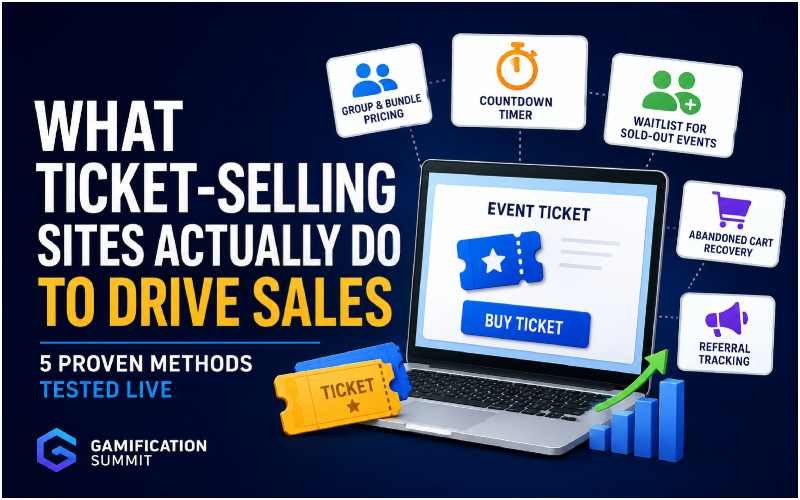
I also recommend reading my guide on what ticket-selling sites actually do to drive sales because the ticketing system is only one part of the sales process.
Final Checklist Before Launch
Before publishing the ticket link, make sure the buyer can answer these questions without contacting the organizer:
| Buyer question | Ready? |
|---|---|
| What does my ticket include? | Yes / No |
| How much will I actually pay? | Yes / No |
| Which ticket should I choose? | Yes / No |
| What information do I need to provide? | Yes / No |
| Can I complete checkout on my phone? | Yes / No |
| Which payment methods can I use? | Yes / No |
| How do I know my payment succeeded? | Yes / No |
| Where is my ticket or confirmation? | Yes / No |
| What should I do after registering? | Yes / No |
If several answers are unclear, the ticket website still needs work. The strongest ticket-buying experience does not need to look complicated. It needs to make the important information easy to find and the transaction easy to complete. For a GamificationSummit event, I would judge the website by that complete journey rather than by the number of features shown on a pricing page.
A ticketing website succeeds when the buyer can move from interest to registration to payment to confirmation without unnecessary confusion. That is the standard I would use when comparing websites for ticket sale gamificationsummit events.